Dark Academia
14 screens in one consistent style. Same palette, same type scale, same components — so the app you build reads as one product instead of 14 unrelated pages.
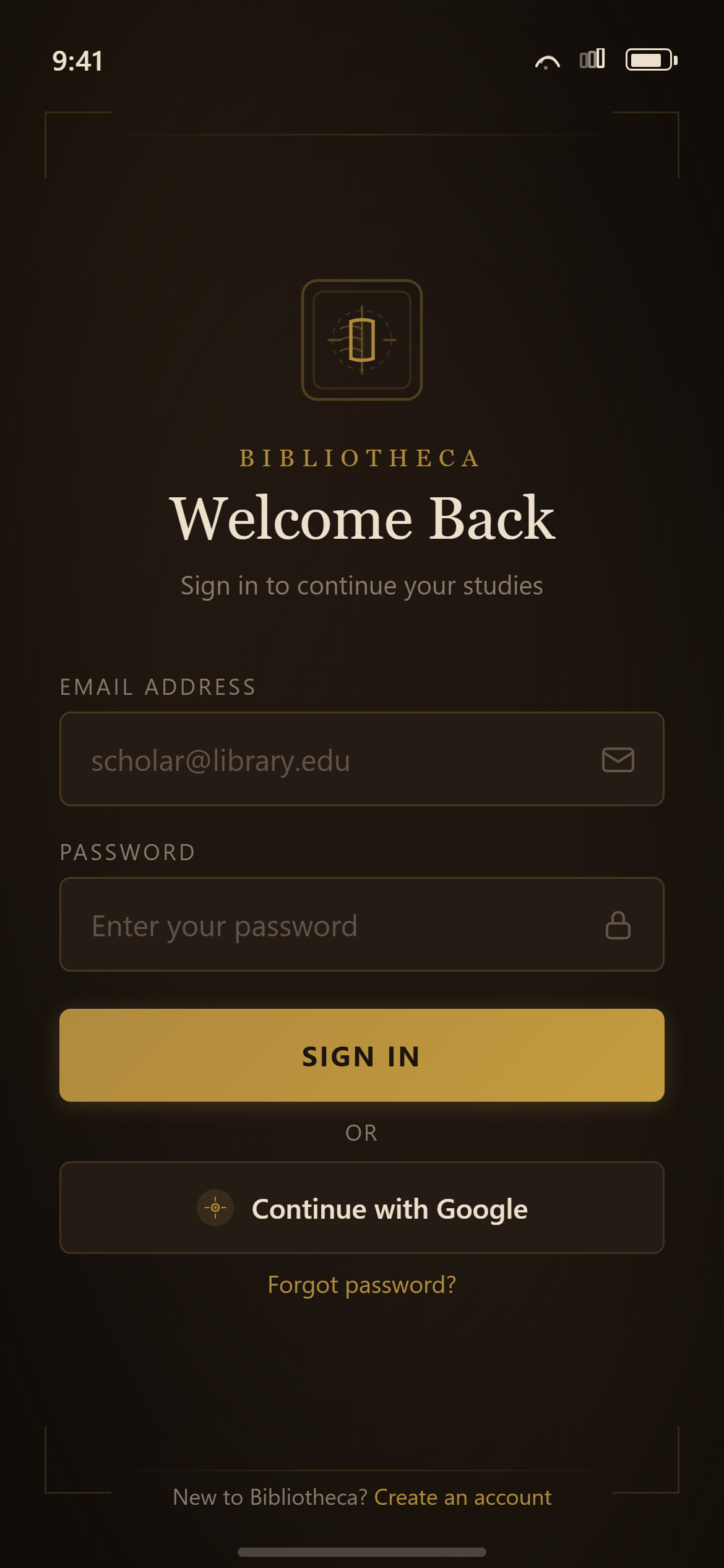
Dark Academia Login
Login
Prompt
Design a login screen with email and password fields, a primary sign-in button, a secondary social-login button with a small neutral circular icon glyph (no real brand logo) and "Continue with Google" label, and a small "Forgot password?" link for a responsive mobile and web app.

Visual style — Dark Academia:
Deep wood-brown and leather tones with ornate thin gold-foil rule lines framing cards, classic serif display headings evoking old library books, and small candle-lit vignette shading in corners. Scholarly, moody, gothic-library aesthetic.

Color palette — Leather Gold:
Background #1B140F, surfaces #241B14. Text #EDE0CC. Accent gold #B08A3E.

Commit fully to this style — it should be unmistakable at a glance. Use realistic content, not placeholder text. Keep animations smooth (200ms ease-out).
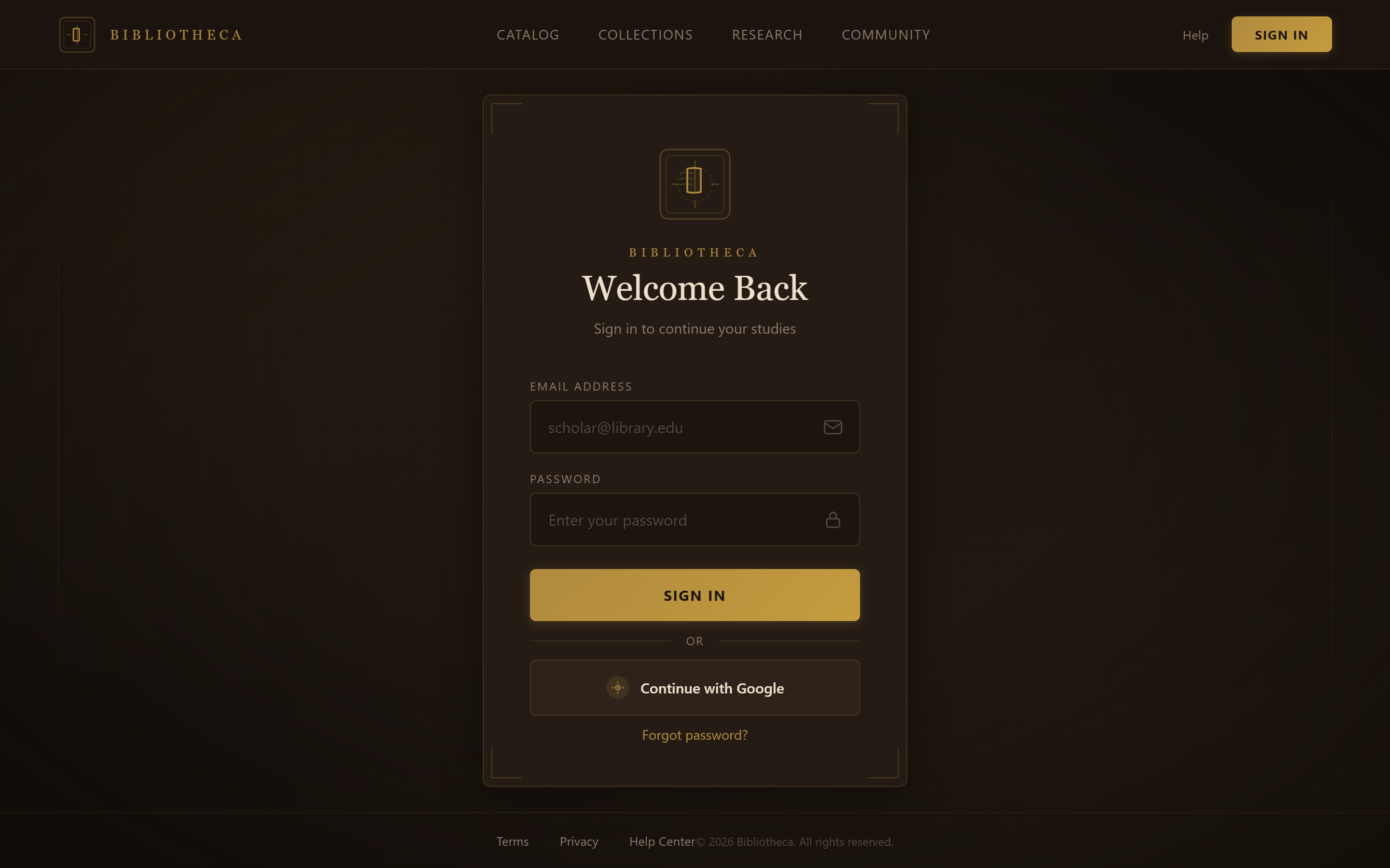
Dark Academia Login
Login
Prompt
Design a login screen with email and password fields, a primary sign-in button, a secondary social-login button with a small neutral circular icon glyph (no real brand logo) and "Continue with Google" label, and a small "Forgot password?" link for a responsive mobile and web app.

Visual style — Dark Academia:
Deep wood-brown and leather tones with ornate thin gold-foil rule lines framing cards, classic serif display headings evoking old library books, and small candle-lit vignette shading in corners. Scholarly, moody, gothic-library aesthetic.

Color palette — Leather Gold:
Background #1B140F, surfaces #241B14. Text #EDE0CC. Accent gold #B08A3E.

Commit fully to this style — it should be unmistakable at a glance. Use realistic content, not placeholder text. Keep animations smooth (200ms ease-out).
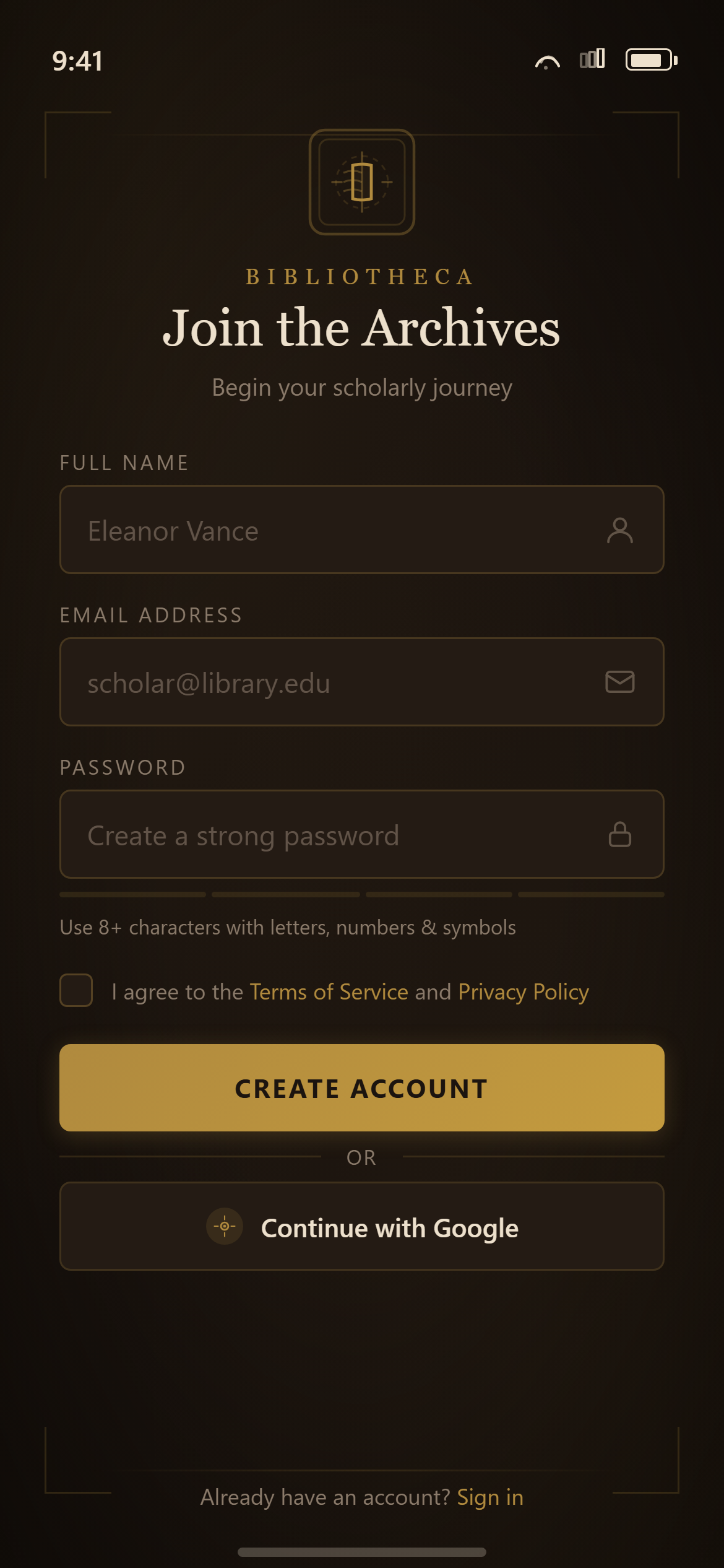
Dark Academia Sign Up
Sign Up
Prompt
Design a sign-up screen with name, email and password fields, a password-strength hint, a terms checkbox, and a primary create-account button for a responsive mobile and web app.

Visual style — Dark Academia:
Deep wood-brown and leather tones with ornate thin gold-foil rule lines framing cards, classic serif display headings evoking old library books, and small candle-lit vignette shading in corners. Scholarly, moody, gothic-library aesthetic.

Color palette — Leather Gold:
Background #1B140F, surfaces #241B14. Text #EDE0CC. Accent gold #B08A3E.

Commit fully to this style — it should be unmistakable at a glance. Use realistic content, not placeholder text. Keep animations smooth (200ms ease-out).
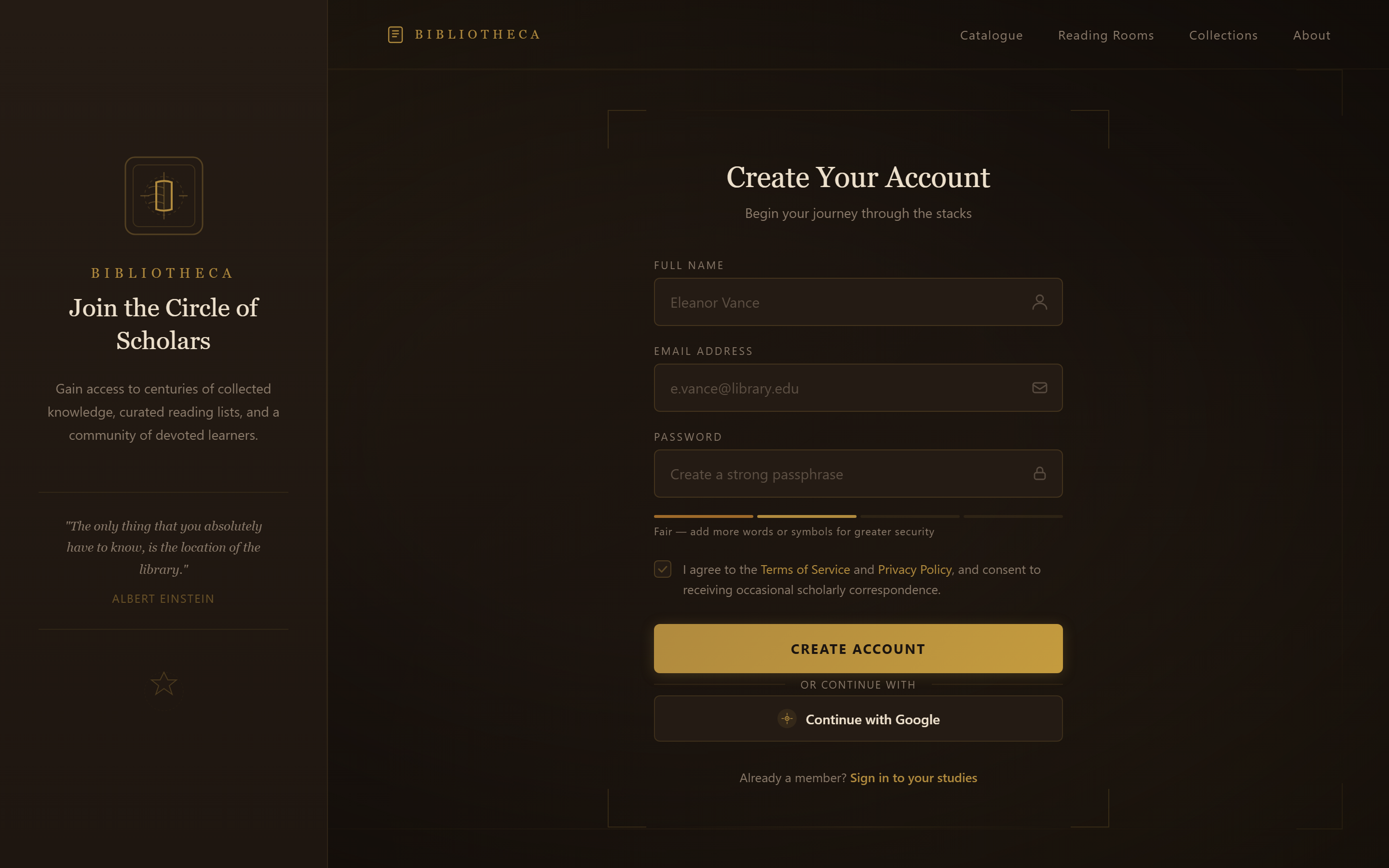
Dark Academia Sign Up
Sign Up
Prompt
Design a sign-up screen with name, email and password fields, a password-strength hint, a terms checkbox, and a primary create-account button for a responsive mobile and web app.

Visual style — Dark Academia:
Deep wood-brown and leather tones with ornate thin gold-foil rule lines framing cards, classic serif display headings evoking old library books, and small candle-lit vignette shading in corners. Scholarly, moody, gothic-library aesthetic.

Color palette — Leather Gold:
Background #1B140F, surfaces #241B14. Text #EDE0CC. Accent gold #B08A3E.

Commit fully to this style — it should be unmistakable at a glance. Use realistic content, not placeholder text. Keep animations smooth (200ms ease-out).
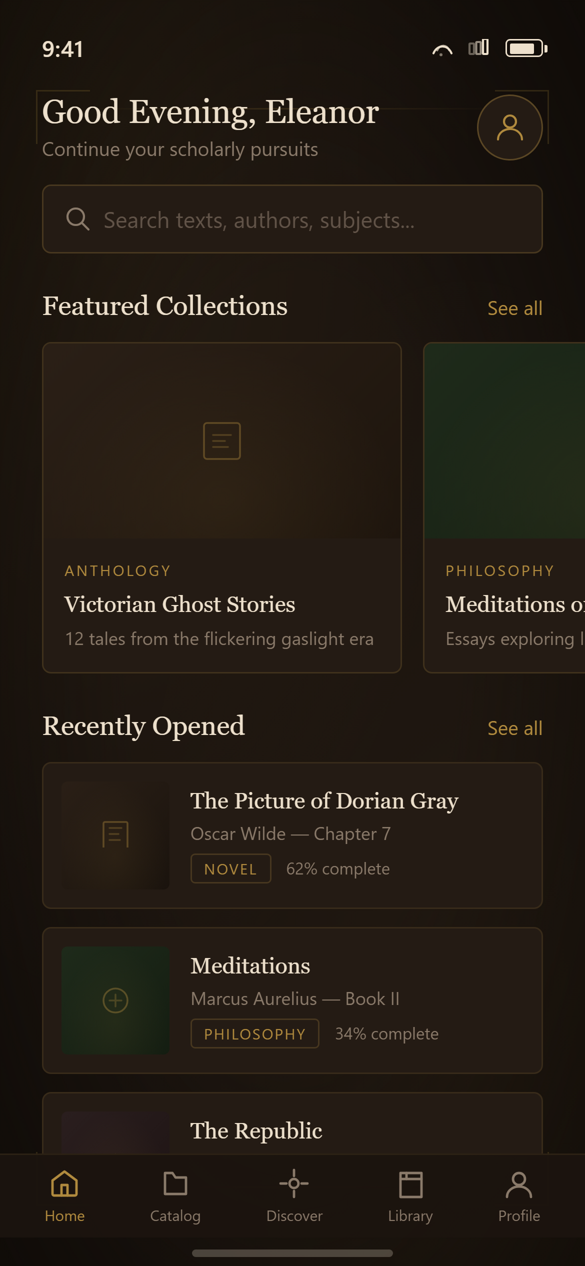
Dark Academia Home
Home
Prompt
Design a home screen with a greeting header and small avatar, a search bar, a horizontally scrolling row of featured cards, a section header with a "See all" link above a vertical list of content cards, and a five-icon bottom navigation bar with home active for a responsive mobile and web app.

Visual style — Dark Academia:
Deep wood-brown and leather tones with ornate thin gold-foil rule lines framing cards, classic serif display headings evoking old library books, and small candle-lit vignette shading in corners. Scholarly, moody, gothic-library aesthetic.

Color palette — Leather Gold:
Background #1B140F, surfaces #241B14. Text #EDE0CC. Accent gold #B08A3E.

Commit fully to this style — it should be unmistakable at a glance. Use realistic content, not placeholder text. Keep animations smooth (200ms ease-out).
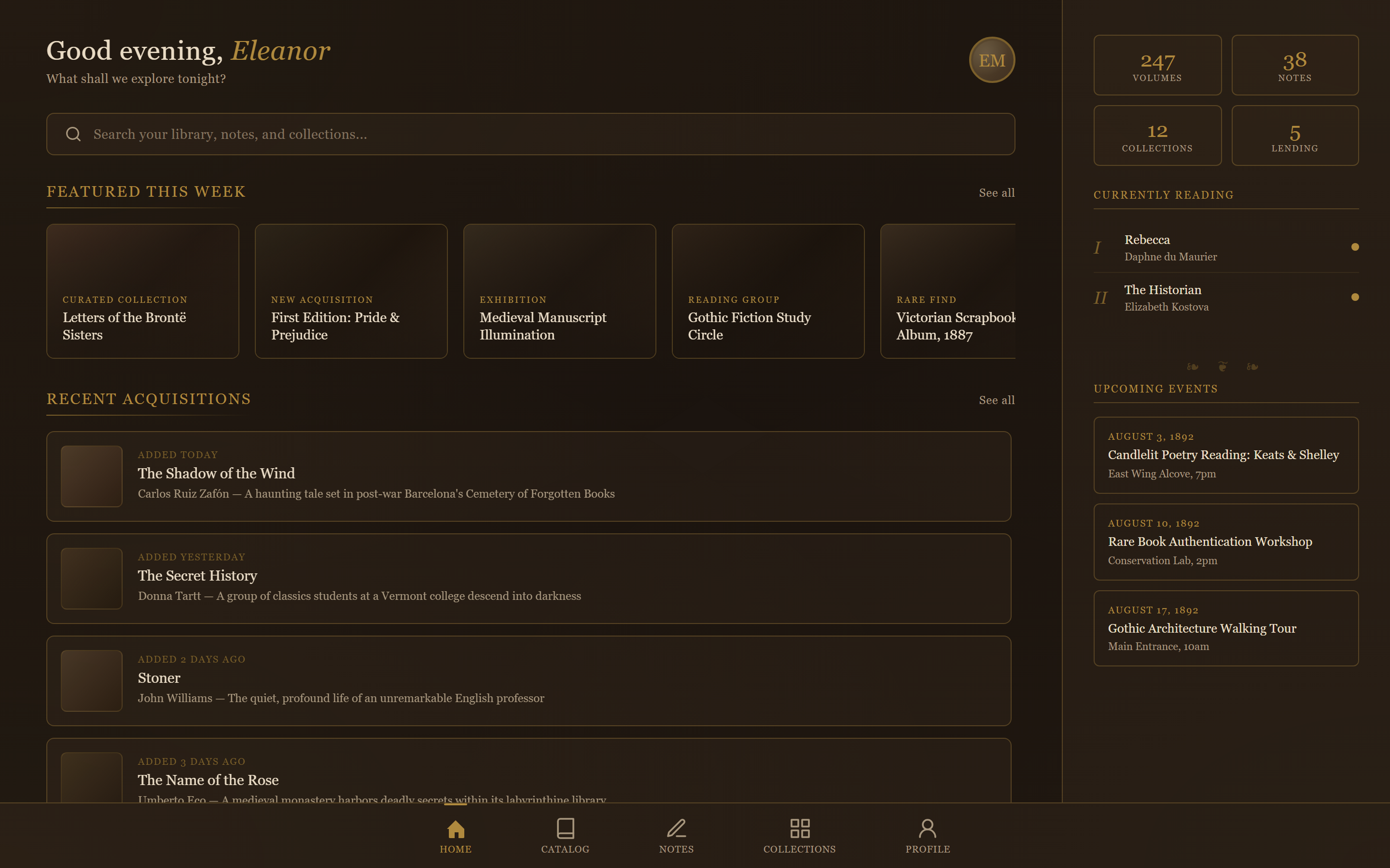
Dark Academia Home
Home
Prompt
Act like a frontend developer with 15 years of experience. I want the exact same UI with 95-99% similarity.

Design a home screen with a greeting header and small avatar, a search bar, a horizontally scrolling row of featured cards, a section header with a "See all" link above a vertical list of content cards, and a five-icon bottom navigation bar with home active for a responsive mobile and web app.

Visual style — Dark Academia:
Deep wood-brown and leather tones with ornate thin gold-foil rule lines framing cards, classic serif display headings evoking old library books, and small candle-lit vignette shading in corners. Scholarly, moody, gothic-library aesthetic.

Color palette — Leather Gold:
Background #1B140F, surfaces #241B14. Text #EDE0CC. Accent gold #B08A3E.

Commit fully to this style — it should be unmistakable at a glance. Use realistic content, not placeholder text. Keep animations smooth (200ms ease-out).
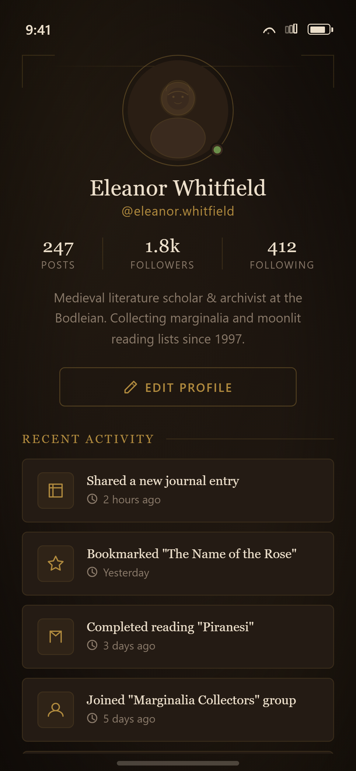
Dark Academia Profile
Profile
Prompt
Design a profile screen with a large centered avatar, name and username, a three-column stats row (posts, followers, following), a two-line bio, an edit-profile button, and a recent-activity list for a responsive mobile and web app.

Visual style — Dark Academia:
Deep wood-brown and leather tones with ornate thin gold-foil rule lines framing cards, classic serif display headings evoking old library books, and small candle-lit vignette shading in corners. Scholarly, moody, gothic-library aesthetic.

Color palette — Leather Gold:
Background #1B140F, surfaces #241B14. Text #EDE0CC. Accent gold #B08A3E.

Commit fully to this style — it should be unmistakable at a glance. Use realistic content, not placeholder text. Keep animations smooth (200ms ease-out).
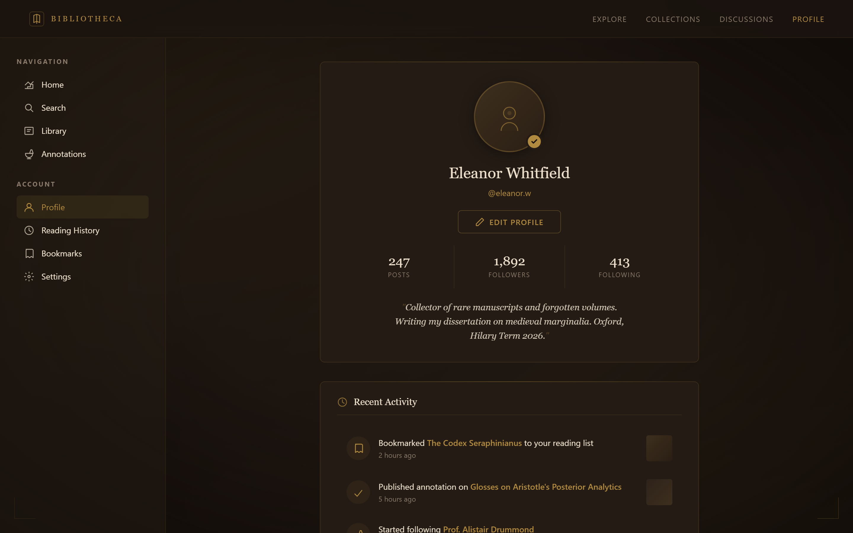
Dark Academia Profile
Profile
Prompt
Design a profile screen with a large centered avatar, name and username, a three-column stats row (posts, followers, following), a two-line bio, an edit-profile button, and a recent-activity list for a responsive mobile and web app.

Visual style — Dark Academia:
Deep wood-brown and leather tones with ornate thin gold-foil rule lines framing cards, classic serif display headings evoking old library books, and small candle-lit vignette shading in corners. Scholarly, moody, gothic-library aesthetic.

Color palette — Leather Gold:
Background #1B140F, surfaces #241B14. Text #EDE0CC. Accent gold #B08A3E.

Commit fully to this style — it should be unmistakable at a glance. Use realistic content, not placeholder text. Keep animations smooth (200ms ease-out).
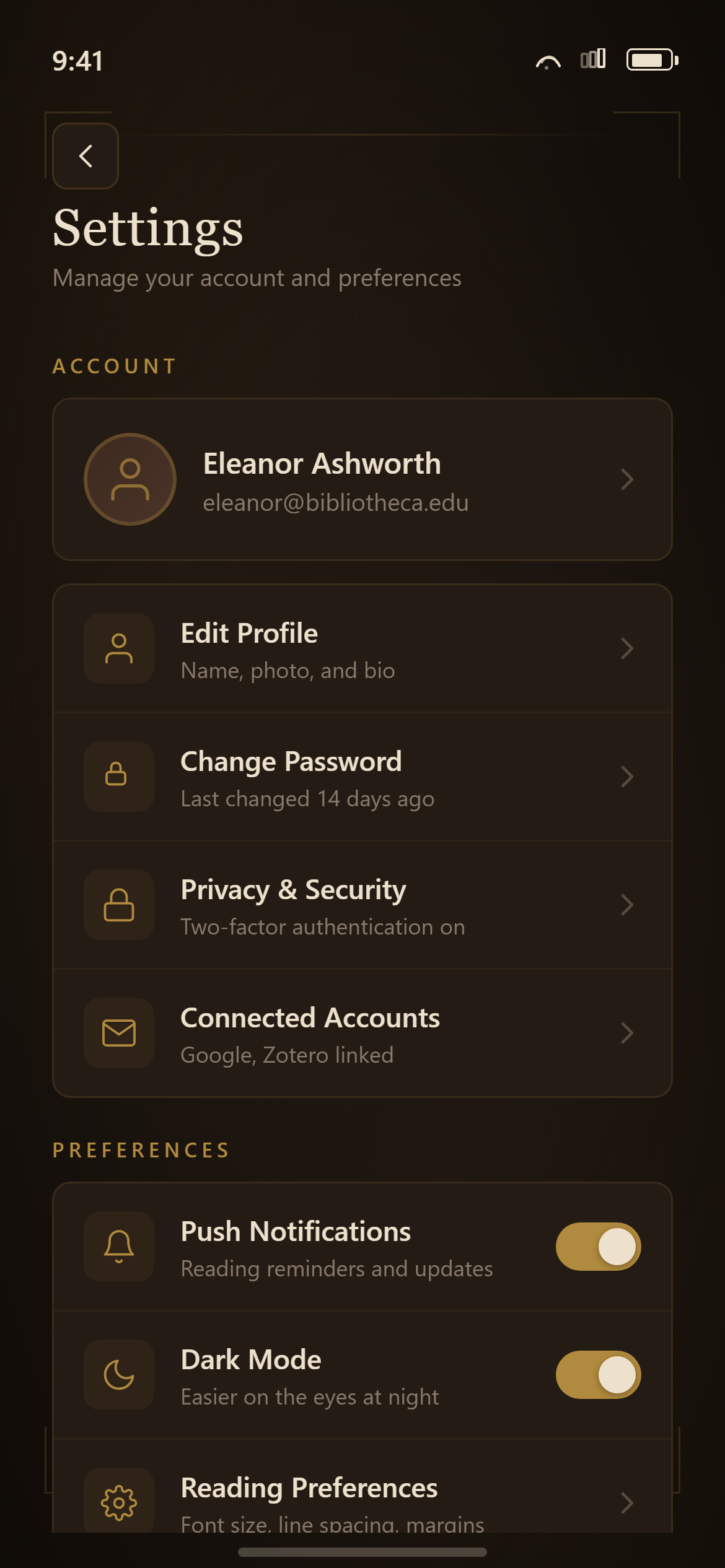
Dark Academia Settings
Settings
Prompt
Design a settings screen with grouped sections (Account, Preferences, About) of rows with icons and chevrons, toggle switches on the notifications and dark-mode rows, and a red sign-out row at the bottom for a responsive mobile and web app.

Visual style — Dark Academia:
Deep wood-brown and leather tones with ornate thin gold-foil rule lines framing cards, classic serif display headings evoking old library books, and small candle-lit vignette shading in corners. Scholarly, moody, gothic-library aesthetic.

Color palette — Leather Gold:
Background #1B140F, surfaces #241B14. Text #EDE0CC. Accent gold #B08A3E.

Commit fully to this style — it should be unmistakable at a glance. Use realistic content, not placeholder text. Keep animations smooth (200ms ease-out).
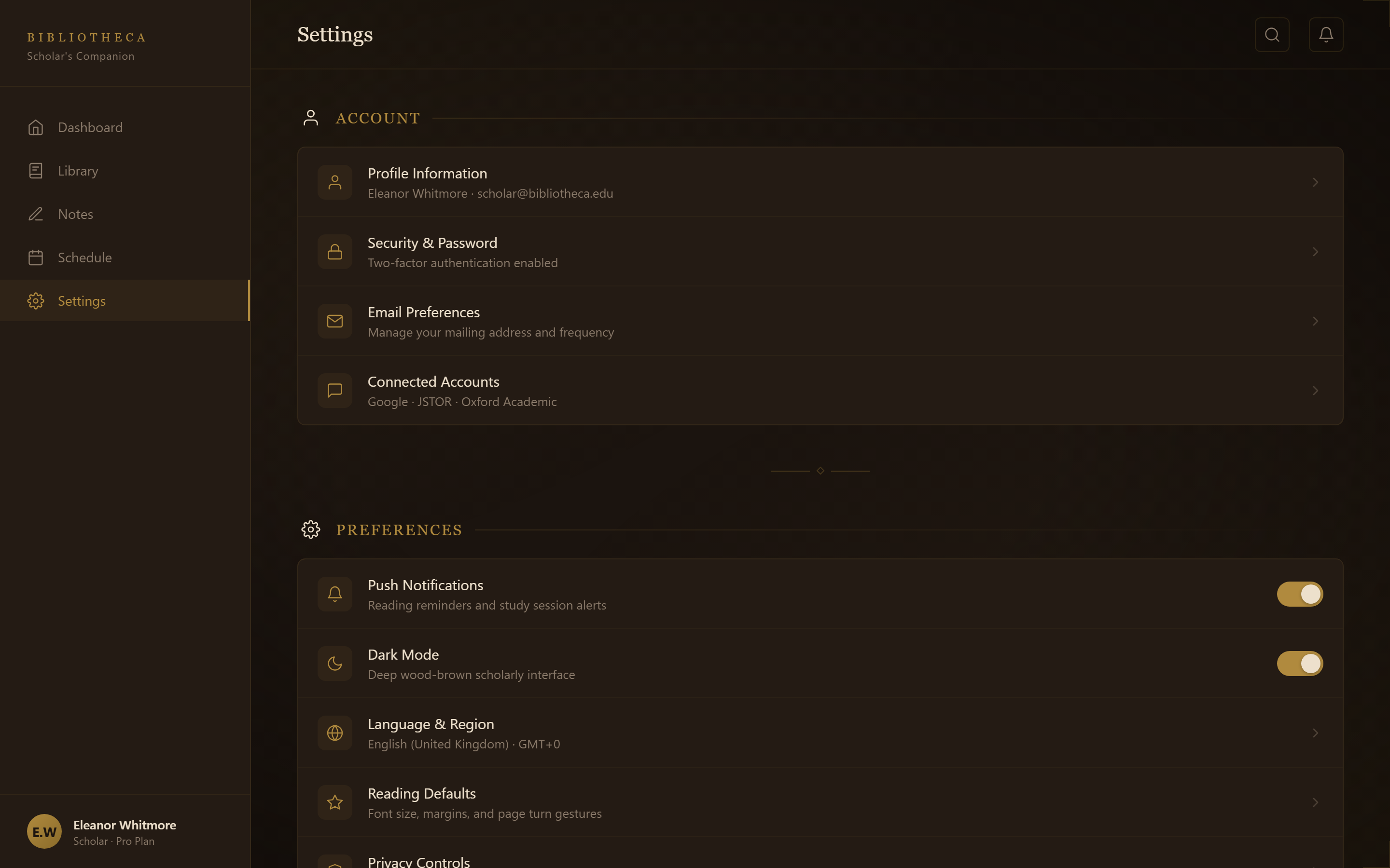
Dark Academia Settings
Settings
Prompt
Design a settings screen with grouped sections (Account, Preferences, About) of rows with icons and chevrons, toggle switches on the notifications and dark-mode rows, and a red sign-out row at the bottom for a responsive mobile and web app.

Visual style — Dark Academia:
Deep wood-brown and leather tones with ornate thin gold-foil rule lines framing cards, classic serif display headings evoking old library books, and small candle-lit vignette shading in corners. Scholarly, moody, gothic-library aesthetic.

Color palette — Leather Gold:
Background #1B140F, surfaces #241B14. Text #EDE0CC. Accent gold #B08A3E.

Commit fully to this style — it should be unmistakable at a glance. Use realistic content, not placeholder text. Keep animations smooth (200ms ease-out).
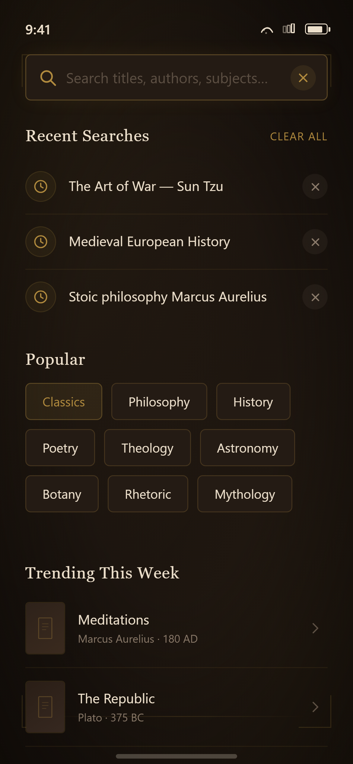
Dark Academia Search
Search
Prompt
Design a search screen with a focused search bar, a "Recent searches" list with small clock icons and remove buttons, and a "Popular" section of tappable chips for a responsive mobile and web app.

Visual style — Dark Academia:
Deep wood-brown and leather tones with ornate thin gold-foil rule lines framing cards, classic serif display headings evoking old library books, and small candle-lit vignette shading in corners. Scholarly, moody, gothic-library aesthetic.

Color palette — Leather Gold:
Background #1B140F, surfaces #241B14. Text #EDE0CC. Accent gold #B08A3E.

Commit fully to this style — it should be unmistakable at a glance. Use realistic content, not placeholder text. Keep animations smooth (200ms ease-out).
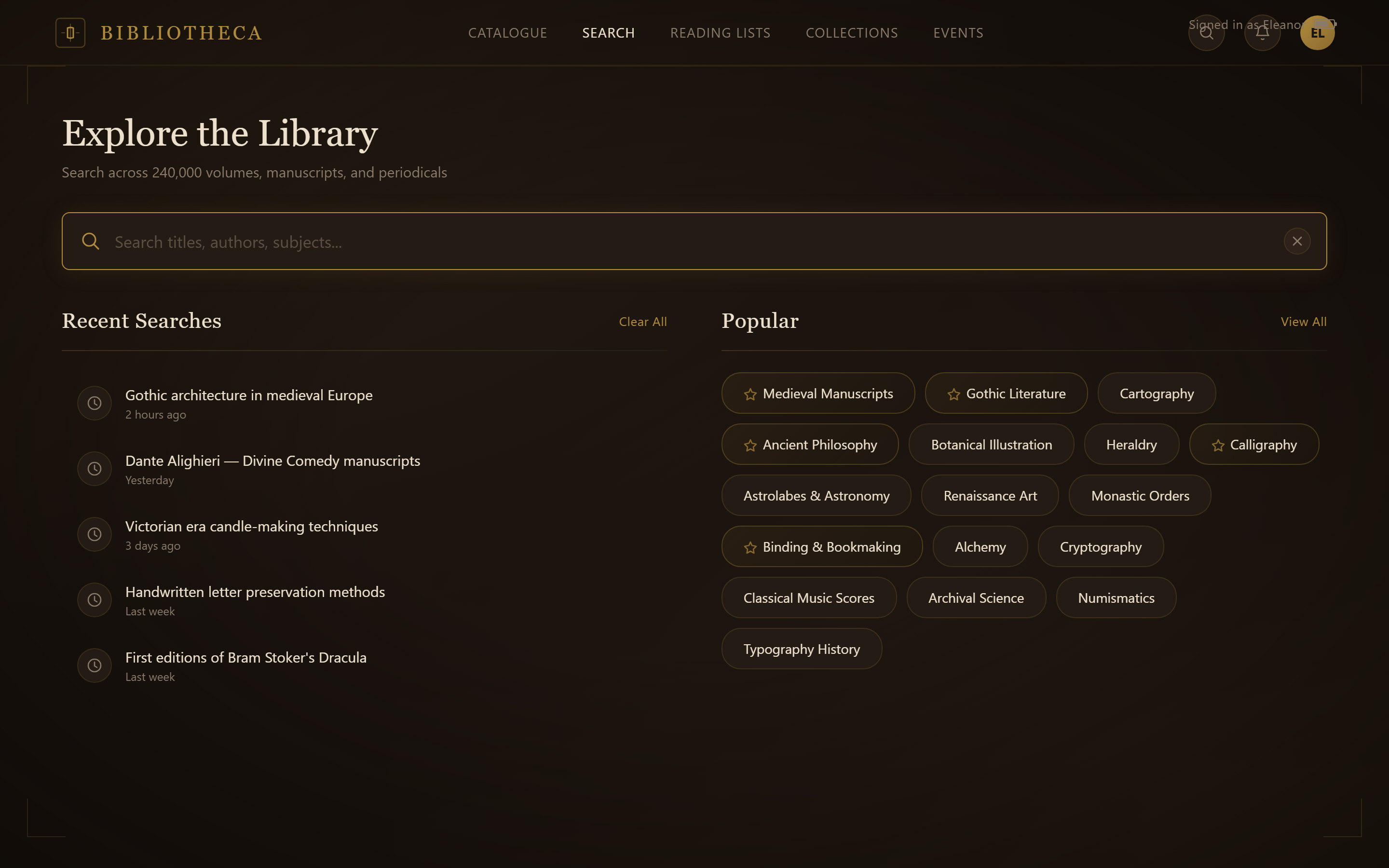
Dark Academia Search
Search
Prompt
Design a search screen with a focused search bar, a "Recent searches" list with small clock icons and remove buttons, and a "Popular" section of tappable chips for a responsive mobile and web app.

Visual style — Dark Academia:
Deep wood-brown and leather tones with ornate thin gold-foil rule lines framing cards, classic serif display headings evoking old library books, and small candle-lit vignette shading in corners. Scholarly, moody, gothic-library aesthetic.

Color palette — Leather Gold:
Background #1B140F, surfaces #241B14. Text #EDE0CC. Accent gold #B08A3E.

Commit fully to this style — it should be unmistakable at a glance. Use realistic content, not placeholder text. Keep animations smooth (200ms ease-out).
Dark Academia Notifications
Notifications
Prompt
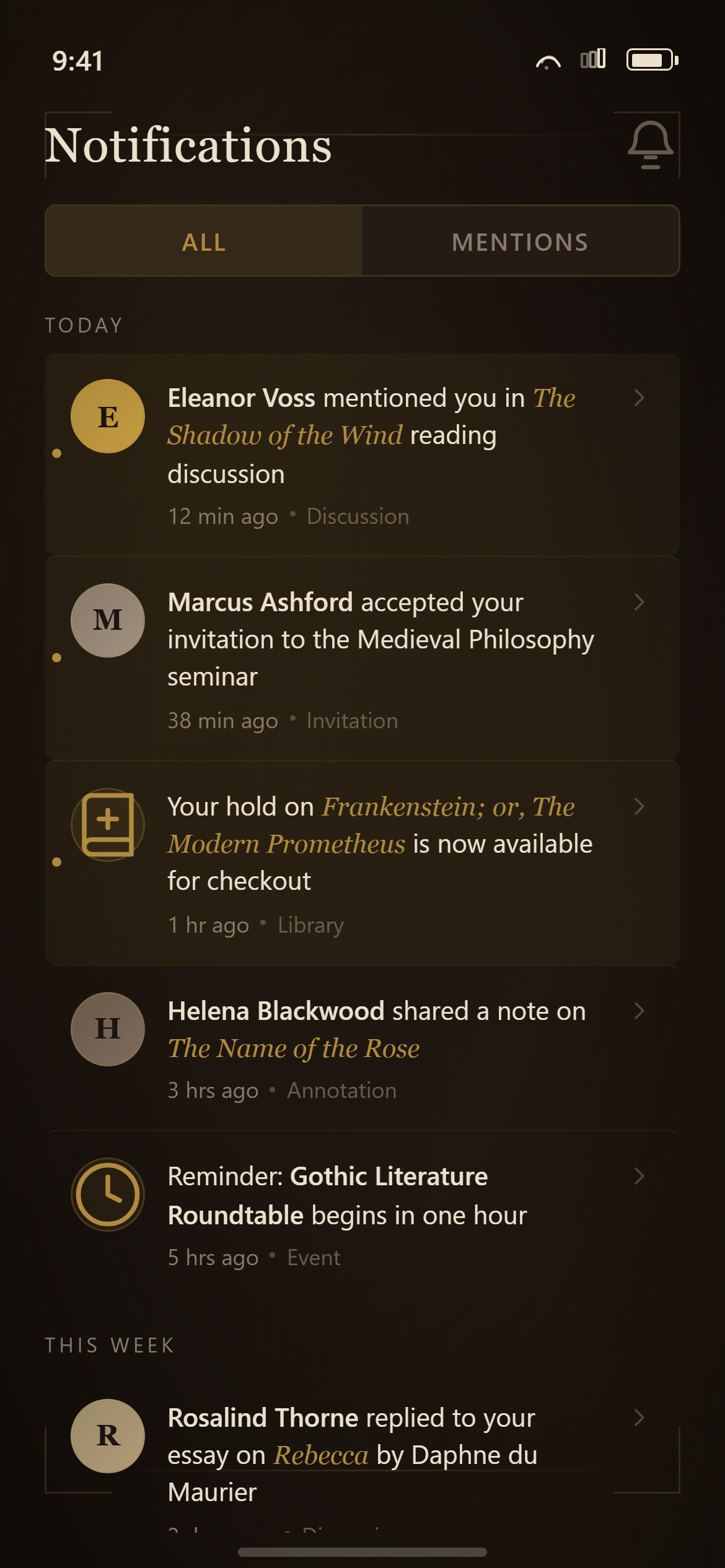
Design a notifications screen with All/Mentions segmented tabs, notification rows grouped under "Today" and "This week" headers, each row with an avatar or icon, a message with the actor name in bold, a timestamp, and unread rows subtly highlighted for a responsive mobile and web app.

Visual style — Dark Academia:
Deep wood-brown and leather tones with ornate thin gold-foil rule lines framing cards, classic serif display headings evoking old library books, and small candle-lit vignette shading in corners. Scholarly, moody, gothic-library aesthetic.

Color palette — Leather Gold:
Background #1B140F, surfaces #241B14. Text #EDE0CC. Accent gold #B08A3E.

Commit fully to this style — it should be unmistakable at a glance. Use realistic content, not placeholder text. Keep animations smooth (200ms ease-out).
Dark Academia Notifications
Notifications
Prompt
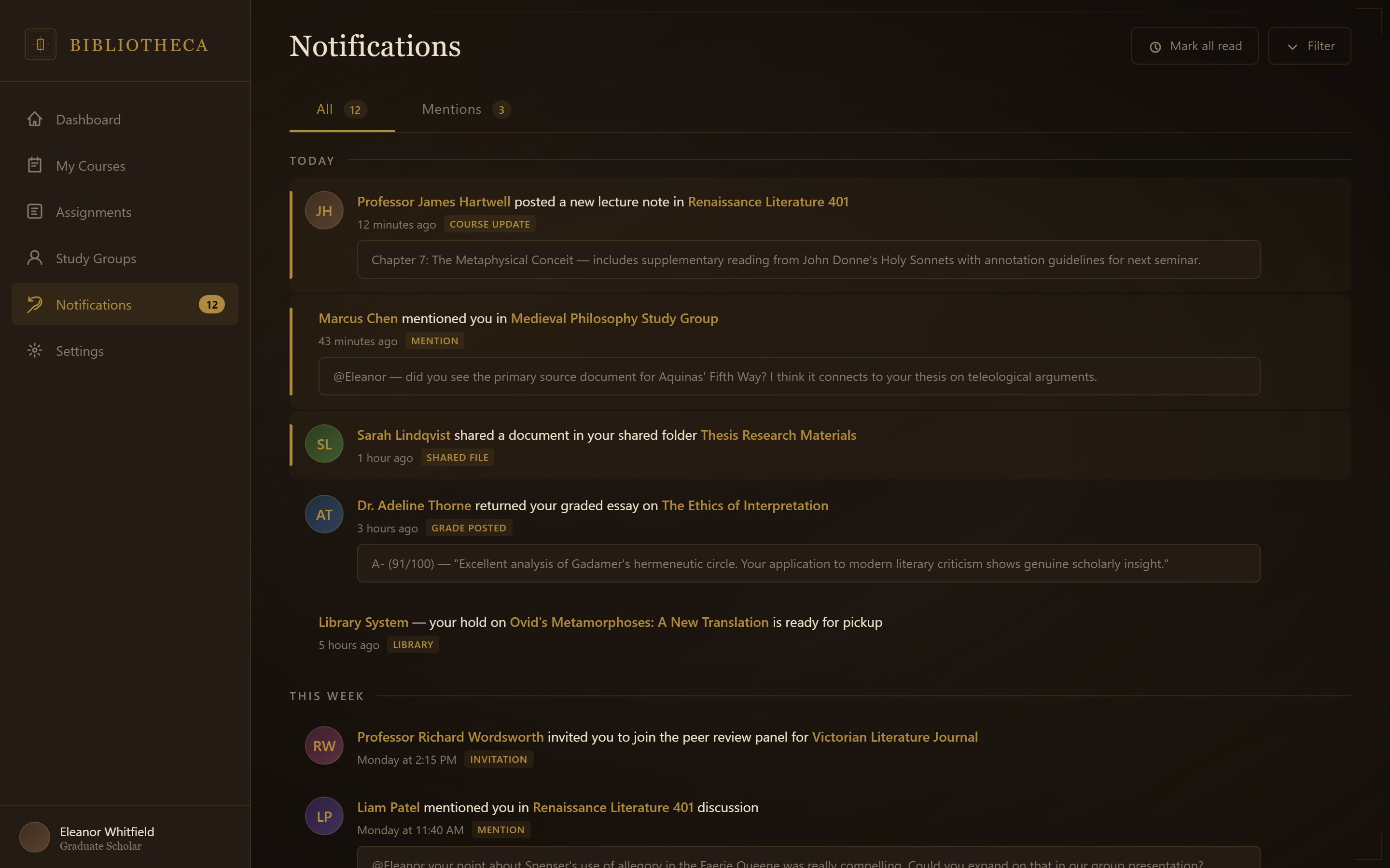
Design a notifications screen with All/Mentions segmented tabs, notification rows grouped under "Today" and "This week" headers, each row with an avatar or icon, a message with the actor name in bold, a timestamp, and unread rows subtly highlighted for a responsive mobile and web app.

Visual style — Dark Academia:
Deep wood-brown and leather tones with ornate thin gold-foil rule lines framing cards, classic serif display headings evoking old library books, and small candle-lit vignette shading in corners. Scholarly, moody, gothic-library aesthetic.

Color palette — Leather Gold:
Background #1B140F, surfaces #241B14. Text #EDE0CC. Accent gold #B08A3E.

Commit fully to this style — it should be unmistakable at a glance. Use realistic content, not placeholder text. Keep animations smooth (200ms ease-out).